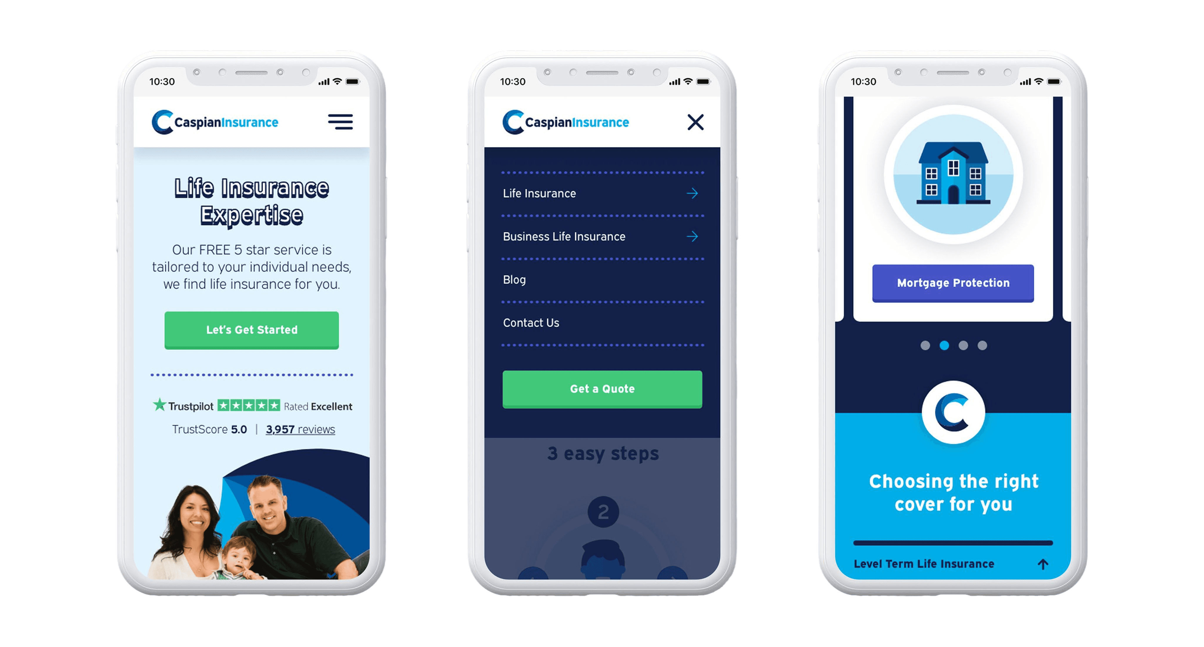
The refreshed identity brings a more modern and distinctive feel to Caspian, while retaining elements of the original brand. The new mark uses the “C” from Caspian with a contemporary swirl inspired by the Caspian Sea and its waves, a subtle nod to the brand’s heritage, but with a much cleaner, more refined execution. I carried this visual language through to the website, using the swirl as a flexible graphic element to add movement and personality without relying on generic stock imagery. I also created a set of bespoke illustrations to bring the services to life, giving the site a more ownable feel and helping it feel less like a traditional insurance website. Bright blue tones add energy to the existing palette, while green CTAs create a clear visual contrast, making key actions instantly recognisable and giving the overall experience a more approachable, confident feel. The result is a brand and digital experience that feels fresh, trustworthy and distinctly Caspian, giving the business a visual identity that better reflects the people behind it and the customers it serves.